Showing posts with label acrylic inks. Show all posts

Saturday, 26 May 2012

PRICKLY PEARS


Went on a two day acrylic ink course to find out what another artist did with her inks. Great fun using salt, cling film, tissue paper etc. We each chose a different image from boxes of photos taken on her (Sue Williams) travels and I chose a series of prickly pear photos she had taken in Australia. This is just one of them using cling film, though I should have waited longer for it to dry before removing to give stronger texture.


Did a larger one with lots of crystal and table salts giving good texture. Cut a piece out and framed for a forthcoming show. Will photo and post shortly.

With my apologies for lack of commenting on your posts due to family commitments and lack of  time.  I have quick peep from time to time.

Friday, 9 March 2012

SPANISH DANCER in spots!


I posted on my flickr account the original ink sketch of this Spanish dancer. .. but afraid the blogger is not working well and has created these bands. Its Saturday and tried to upload again and ok this time round!


Here it is finished in acrylic inks and soft Liquitex acrylic paints. Painting size 10" x 16" on canvas sheet to be put into a double mount and silver frame.


The guitarist at the back has been added to create an image to go with the show title of


IN RESPONSE TO MUSIC being exhibited at the Dereham gallery during the Dereham Music Festival in May.


Have any of you been having the same trouble uploading images as I have of late. ????????? Its why I haven't posted recently. I have tried four times to upload these and each time they have gone into bands of colour, ie the yellow at the bottom of the finished work. I have given up and decided to let you see what I can upload - if you are interested in the original ink sketch please check out my Flickr account (see side bar for link).


I now plan to create a group of dancers in red with the guitarist more prominent. Not sure how it will go.


My ideas have come from a visit to Majorca with my daughter and her eldest some years back when we had a dance troup entertain us one evening at the hotel. The spotted dress has always stayed in my mind.

Monday, 13 February 2012

ENGLISH COUNTRY GARDEN


I needed cheering up with the cold and snow and now miserable rain out there, so decided to create a typical English summer garden for myself. Washed colours of acrylic ink onto a sheet of Lana Vanguard and then had fun playing and layering!! How many plants can you name????


Thursday, 17 November 2011

MORE ITALIAN ACRYLIC INK WORK

Haven't painted much new work lately but you may remember my Italian practice work last year when Anita and I had planned to visit Italy sketching together. Had to put it off, but will make an effort to organise next year. So I thought I'd show you a couple of small pieces created from a trip to Italy a couple of years ago.

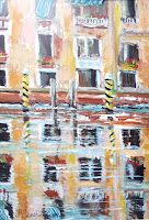
GONDOLA CORNER

This little painting is from my visit to Venice two summers ago when I went to Italy with Clive for our 50th anniversary. Its framed in my art study as a lovely reminder of a lovely time. Thought you'd like to see it. BTW, acrylic ink on Lana Vanguard support. Quite small at 8" x 5" in a 14" x 12" frame.


GRAND CANAL REFLECTIONS

Here's another little acrylic ink on Lana Vanguard done at home from photos taken during the same holiday whilst going down the Grand Canal on one of the ferries. Just 8" x 11" currently only in a two inch double mount awaiting framing.


Both going into Christmas shows at local Norfolk galleries.

Sunday, 25 September 2011

PAPPA DRAGON OVER THE SEA


At last I have completed pappa dragon for my trio for the DRAGONS AND PEARLS event in Sherringham. This time over the sea with castles in the background. .. and instead of breathing out flames he has pearls coming out of his mouth and floating away.


Here are some close ups of the various parts from wings, legs, tail, castles and pearls providing more detail, texture and colour:


Here is pappa's head with the pearls breathing out of his mouth instead of flames. I think I might add two horns before calling it a day and completing my trio family of dragons. Its been lots of fun.


Monday, 12 September 2011

MUMMY DRAGON WITH PEARLS

This is the second in the family trio of dragons for the Dragons and Pearls Event in October. Although I consider her finished, I might add some more colour (greens probably ) to the wings. What's your opinion?


Here are two images of the work in progress.


As you can see from the top finished work, I adjusted her after this as the belly and back portions needed to run into each other more smoothly... and I darkened the area behind the large pearl in her hand to help make it more prominent, turning it into a rock for her right arm to rest on.


Now onto number three - daddy, which I think I will do all in shades of blue and make him strong, fiery and handsome! Not sure about the background having already used a tree for baby and mountains for mummy.

Sunday, 4 September 2011

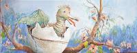
BABY DRAGON


This has been great fun and part of a trio. A project entitled DRAGONS AND PEARLS to be part of the Sherringham and Cromer festival in October .... and here is a close up of an earlier stage of the baby dragon.


This is my first piece of a trio in acrylic ink on canvases 30" x 12" . Don't know why I tackled the baby dragon emerging from his egg high in a blossom tree first but I am offering him to the Turning Point Healing Centre to raffle to raise funds.


Following is the sketch onto the canvas using Stabilo 45 fine liner soluble pen. Works well as you can adjust the lines with a little water.


I plan to do his mum as a very demure feminine lady dragon adorned with pearls ........ as yet dad is only a twinkle in my minds eye looking very handsome and created in shades of blues. Here are some ideas in graphite.


Monday, 22 August 2011

NORTH WALSHAM NEW ART CENTRE STORYBOARD


This is the completed canvas 14" x 40" high for the Opening of the new Art Centre constructed alongside the North Walsham High School. Its three paintings were created in acrylic ink on Lana Vanguard adhered to the canvas. An artist friend likened it unto a story board as I was inspired by the variety of students' work in the art department and, of course, the amazing architecture of the new art centre. All in all, great fun to do.


Here is a close up of the third acrylic ink collection mainly inspired by student's work in the art department. I could not resist the cat/dog or whatever animal it is created for a ghouls and ghosties project their tutor gave them and , of course, we always need a big butler sink with all that paint and dirty brushes about .


Sunday, 14 August 2011

NORTH WALSHAM NEW ART CENTRE

A small town 7 miles from my home recently received a grant to build a new prestigious art centre available to students and the community. The local NOVA group of artists were invited to produce work for the opening. Along with other members I visited the construction and art department of the school to get inspired to create work for submission. I am producing one canvas 40" long with three images painted with acrylic inks onto my favourite Lana Vanguard support, stuck to the canvas with gesso.


The top image is of the construction showing part of the school behind. The added school logo is one I noticed in the art department.


This is the second image create by a visit into the school art department. The faces along the top were inspired by those made by the students with wire. The hard hats appear because we took them off and placed them on a blue table top after our visit to the construction.


I have ideas for the third image based on seeing the butlers sink and a big black cat piece of artwork in the art department and probably a row of what seemed like Russian dolls, but I think were painted ceramic bottles created by the students. I'm pleased with how its going, but have ideas about outlining each block image with thick black marker pen and bringing out some of the objects by outlining in pen. Nor sure yet.


Wednesday, 4 May 2011

SPIRITUAL PIECES FOR GRIMSTON CHURCH

Every year The Rev. William Howard organises a CELEBRATION OF ART at his church in Grimston near Kings Lynn in West Norfolk. Many times in the earlier days I used to prepare what I call 'spiritual' works and have often been asked when I am going to do some again. This year I planned to find time to do just that. Here are the results of two pieces created with acrylic inks 12" x 12" on Lana Vanguard.

Number one is called THE BORN LEADER. Trust you prefer the changes to the figure on the right hand side. I do!!


... as an earlier stage I decided the figure on the right handside was too big and I did not need the complexity of two heads together.


This is number two THE TAX COLLECTOR. Inspired by the eagle lectern at Oxborough - one of the many pre-reformation lecterns created with slits to take household taxes for Rome.


This is an early stage of planning.


... and after many adjustments and colour changes following yet another visit to the Oxborough church, came to this final piece.


Hope they will be well received at the exhibition starting 24th May through to the end of the month.

Sunday, 3 April 2011

EASTERN OPEN 2011

I was pleased to be advised that the following work was accepted for the EASTERN OPEN 2011 and yesterday Sandra joined me to attend the opening at the Kings Lynn Art Centre. Out of 642 works submitted from 7 east of England counties, 126 were exhibited. Although I did not share in any of the prizes, visiting the Red Barn (one of the four galleries at the Centre used for the show) I noticed a lovely red spot on my work. The Assistant Arts and Education Manager introduced me to the buyer and we had an interesting chat. Gathering at the Magic Pool This work was created with acrylic inks on the contemporary slippery surface of YUPO/Lana Vanguard I have been experimenting with over the past 2 years. The judges were Professor Nick de Ville a 70's designer of album sleeves and tutor at the Goldsmiths' College; Anna Lucas a London based artist film maker; and Poul Webb a watercolourist and past student at Cambridge School of Art, work acquired by the HM Government Art Collection and exhibitor at the Royal Academy, Museum of Modern Art at Rijeka plus many other prestigious international events. Their comments were most encouraging ie '...all artists chosen can justly be proud of having created a very strong and contemporary Eastern Open 2011.'

Thursday, 30 September 2010

VENICE ON YUPO FROM SKETCHES

Today Anita booked our trip to Italy for May to benefit from an early booking reduction. Whilst discussing all the ideas over the past week on the phone, thought I'd like to do a painting from my sketchbook. So decided to use two sketches and put them together of when I went to Venice last year. I decided to use acrylic inks on YUPO (well that new Vanguard I have been telling you about available from Jacksons of London).

This is the finished piece, measuring 20" x 8". Gondolas look very dark here, hope you can enlarge and see the detail in this corner.

Here are a few cropped photos as the work progressed.


It was lots of fun as the sky changed colour radically and the darker corner (where the gondolas are) changed a lot in respect of shadow, moving water and the addition of the poles.
Clive reckons the light shows the scene as it would be just before dusk.
I think I might try some more another time from the sketches Anita and I have been doing from the BBC Art programme series POWER OF ART. Nothing like getting the feel for Italy 6 months before you go!!!

Wednesday, 8 September 2010

NUMBER 3 SURFER COMPLETED

Finished painting 10" x 10" mounted and framed in light wood.

This week I have been working on the third surfer acrylic ink painting for Sheringham Reflections show in October and am very pleased with the result. It reminds me of the days I lived in Dorset and used to paint the sea quite a lot. Now I realise I have missed it as I so thoroughly enjoyed creating the waves and blending all the colours.


Thought you'd like to see some close ups of stages as I worked:


1) I was very pleased how I created the silvery lavender colour for the first background layer all over the Lana Vanguard silky sheet put on with a soft spongey 4 inch roller. I used Mars Red, touch of prussian blue and lots of white acrylic inks with cerulean watercolour:


2) Here I am at my working bench in the little upstairs studio, showing the colours I had chosen for the painting and my original photograph and how I was adding the figures colour by colour using quite soft water colour brushes. size 3 and 8 making them much larger and closer together:


3) Here's a close up of the boy and his blue surf board reflection after I had removed the masking fluid:


... 4) and finally a close up of the main wave showing all the colours I put into the water.


IT WAS FUN!

Saturday, 4 September 2010

SECOND SURFER PAINTING IN ACRYLIC INKS

I have now completed number two of the trio of surfers for the Sheringham Reflections show.

When I visited Mundesley beach with the grand children, they were putting out the colourful flags for the surfers and swimmers and I took many photos. This one I feel reflected (ha ha!!) what I wanted to achieve. It had the dark back drop, against which the figures and flags showed up well and I must admit had staggeringly elongated reflections in the water lapping the beach. I did quite a few adjustments to the original photo, strengthening the colour of the sand and softening the distant buildings. I used a different blue to number one surfer painting, mainly because I had run out of cerulean acrylic ink!! I think I might cheat on number three and add some cerulean blue watercoloour to my mix to get back to the softer blue. You'll also notice that I did not put in any detail to either of the faces.

Here is a close up of the reflections, which I was very pleased with , without too much fiddling and almost exactly as I put down the paint in the first layer. Some of the white ripples were created with what you call in the US of A miskfit and we call over here in the UK masking fluid, which at the end was rubbed off to reveal the white streaks of water across the top of the reflected colours.


Now I have to consider what image number three will be created from. Always decision making this artwork, isn't it??

Friday, 13 August 2010

REFLECTIONS NOVA SHOW SHERRINGHAM

Have been planning my trio for the Reflections show. After chosing images from a trip to Mundsley beach with the girls (grand children) when I photo'd them playing as well as the surfers, I started one in watercolour. It just looked rather bland, so used it as my draft and decided to get out my new Lana Vanguard similar to YUPO and work in acrylic inks.

Here is the result of number one of a lonely surfer walking along the beach. It was great fun to do and I feel the result is quite interesting particularly as I used salt in the foreground sand area.

Here are some close ups where you can see the effect of acrylic inks on this shiny plastic surface.


Took this photo before I added more white foam around the bottom of the wooden posts.


Here you can see where the course sea salt granules and ground salt were scattered.
I think I shall be happy with this technique for the three pieces. Probably will decide on the one of the girls skipping towards the shoreline, both of them with both their feet off the ground and I can strengthen the reflected images in the wet sand.

Number three yet to be decided upon between a life guard putting out wonderful coloured flags to tell the surfers the condition of the sea and a couple which looks like a dad and son carrying their surf boards down to the sea.


I'll keep you posted. haa haa!

Thursday, 15 July 2010

NOT VERY SUCCESSFUL YUPO PRACTICE

Have been spending the past two days sorting my art room and getting works ready for delivery next Wednesday and Thursday to Kings Lynn and Alby, because I am going over to my girls tomorrow until Monday and bringing our eldest grand daughter back with me for a few days.


But prior to that I was playing with my last sheet of YUPO with acrylic inks and although some areas were successful in this waterfall scene, the whole painting did not work for me. Two close ups I think work individually:


floral area and waterfall reflections


When finished I just felt it was too bright and chocolate box so the following completed painting was washed away in the bath so that I could play again on this my last sheet. Will post the result of that playtime another day - very sombre in comparison about a derelict church interior!


By the way, for those in England, the London Art Supplier Jacksons have stopped stocking YUPO but have an alternative French version called Lana Vanguard. I've ordered a pack so I can continue to play with this technique without having to keep washing out what I did before!!!

Friday, 19 March 2010

PATTERNED MAUVE IRIS

You may remember when Anita visited me back in the winter time, we played with acrylic inks and on the third day, I believe, I eventually created a rather more controlled piece - a yellow and mauve iris study from a photo I had taken in the garden last summer.

I decided I wanted to use this style for submitting work to the Art Circle summer exhibition at Norwich Cathedral, so planned to create a second iris. I scanned through my photos taken at a friend's garden a few years back when all her specialised iris plants were in full bloom and chose this patterned one - and here it is again on 16" square Hahnemuhle Quattro 140 lbs matt watercolour paper, one of my favourite blocks for flowers whether watercolour, acrylic or ink
Finished piece -

Here is an early stage when I decided to add the blues into the top background.

and as a reminder here are the two pieces together both framed in boxed silver with double cream mounts.